Monday, 6 January 2014

Photoshoot Location


Are there any potential hazards that could pose a health and safety risk where your photo shoot will take place (trailing cables/traffic/other objects )? What will you do to ensure these risks are minimised?
When in the photography studio, it is important that whenever flashlights or soft boxes are being used that wires are wrapped around the stand so that cables aren't trailing which could be a trip hazard. In addition, if it isn't possible to wrap the cable around the stand, masking tape can be used to keep the wires down. When doing outdoor shoots, traffic and pedestrians could cause risk if in a busy area. To avoid this, I will use an area that is, if possible, isolated.

Will the time of day/weather affect the outcome of the photos? Have you allowed for this?
When shooting outside, the weather may affect the lighting in the photos - cloudy days may make photos look dull. In addition, sunny days may cast too many shadows on the model. As the weather may be a factor that will reduce the outcome of my photos, I will check the weather forecast prior to days that I plan to shoot outdoors. In the worst case scenario, I may have to use all indoor photos.

Have you considered the background to your photos, particularly if taken outside? How will you ensure you will get the background you want?
Some photos I have decided to have a blank background to emphasise on details such as clothing and hair - this will be done with a white backdrop. On outdoor photoshoots, I will use locations that I feel would make good backgrounds in my photos - such a trees. To get my required background I will, prior to the photoshoot, go out and find areas that I could possibly use.

Have you considered lighting? What about the ‘problems’ of natural lighting, either outside, or streaming through a window? Will you need to use a flash? Have you considered reflective objects that might spoil the effect?
When working in the studio, I have considered using a flash light or softbox with a flash linked up to the camera. Placing lights in the correct position will ensure an even light on the model and backdrop. When shooting outside, I may use the flash on the camera to create as even as possible light on the model - especially if it is a dull day. I will avoid taking photos near reflective objects as they will bounce the light and most likely intensify the light in certain areas of the photo. If lighting isn't completely how I'd like, I will use photoshop to get the lighting how I want it.

Do you need permission to take photos in the place/venue you have in mind?
To shoot in the photography studio, I will need permission from a member of staff to ensure the studio is free. As for outdoor areas, the areas I have in mind, I do not require permission to take photos of.

Do you need to book time in a room (eg the photography studio)?
I will need to book time in the photography studio by contacting a member of staff. Alternatively, if I have finished my work in a photography lesson, I may be able to use that time to take photos.

Are other people/crowds likely to be an issue for you? What have you done to ensure that it will not spoil the effect?
Crowds will only be an issue when shooting outdoors. I will stop this from happening by choosing an isolated area.

Are you reliant on lifts/props/friends’ equipment/models? How have you planned that these things will come together at the appointed time? Plan B? I am extremely reliant on my model and will need to plan at least a week - if not two - ahead of when I require my model to ensure they turn up. I will make sure that my model knows the importance of their attendance. My plan B would be to use my photography classmates as my main models.

Finally, have you thought of every eventuality…?
Regarding my photography, I have planned everything that I hope to achieve.


Photoshoot Planning


What emotional impact do you want your photography do have upon the reader and how will you achieve this?
When a reader looks at my front cover, I want them instantly to be able to identify that my magazine is a rock-based magazine. In addition, I would like the reader to be able to identify the purpose and audience of my magazine. I would want the readers to be able to recognise that the magazine is a music magazine aimed at rock fans. In order to achieve this, I will take into account the colour scheme I use - making sure it is appreciated by my target audience.

What personnel do you need? Who are you going to photograph?
I will be photographing close friends from both outside college and in my photography class. My main images for my article will be of my close friend posing as Dannika from Evarose. My friend will also be my main image on my front cover. My photography classmates will be used for photos in my contents page. I have photographed these people before so I know that the photos will work well.

What props will you need?
For my props, I may need a musical instrument - such as a Guitar or Bass. I may also use drumsticks and guitar picks. For my indoor shoot, I will need a backdrop in order for colour on clothing to stand out. I may also a chair or stool. When doing outdoor shoots, I will use the sky and trees as my backdrop.

How are you going to emphasise colour?
Colour will be emphasised by using a white backdrop (if available) so that clothing colours do not blend in with the background. I may also use black and white photos to emphasis on detail such as makeup and shadows.

Have you briefed your personnel/models?
I have asked and received permission from my friends to take and use photos of them in my magazine. I am yet to discuss what makeup I may require they wear. Any props that I have decided to use (such as instruments) I have access to. I have explained to my models what I aim to achieve when taking photos of them.

What lighting will you need? Any other equipment?
If I get access to the photography studio, I will need lights such as Flash lights and Soft Boxes. If I do an outside photo shoot, I will use natural lighting; if some areas are dark, I will use Photoshop to correctly expose them. I will not require a tri-pod as I will be taking images freehand.

Where will you shoot? Will you need a backdrop?
I plan to shoot both indoors and outdoors to gain a variety of images to choose from. When shooting indoors, I will need some form of white backdrop to emphasise on clothing colours. When shooting outdoors, I will find a suitable location with a natural backdrop.

Mise-en-scene - Make-up? Costumes? Props?
I will require my female models to wear makeup such as eyeliner with the rest of the face very neutral to emphasise on the dark eyeliner. Costumes will be casual clothing - such as band shirts. The use of band shirts will emphasise on my specific Genre. Props will include musical instruments and chairs/stools.


Audience Research

I created a survey on Survey Monkey which allowed me to gather research on the what readers of music magazine find most appealing to buying a magazine. It also allowed me to gather information at what age group my magazine would be aimed at. 


My first question was about how often people read magazines. As most of the responses responded either Weekly or Monthly, this would influence me to either make my magazine a weekly, fortnightly or monthly magazine. Nobody who participated read magazines daily or not at all. 


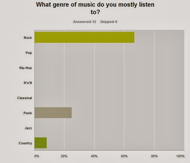
Next I asked what genres of music do people listen to. I found out that the majority of the respondents listen to rock music which has further made me fully decide that my magazine is specifically a rock magazine.  

In this question I found that people tend to buy up to 5 magazines per month, furthering my choice to make it a weekly magazine. Only one respondent buys up to 10 magazines per month. 

I wanted to find out if having a free gift would influence someone to buy a music magazine. I found that out of my 12 respondents, 6 said it would influence them, 6 said it wouldn't. If I were to use a free gift with my magazine, it would be every few weeks in order to appeal to everyone. 

I asked what attracts people to buy a magazine. 2 people said that cover image attracts them to buy, 5 people said the inside articles and 5 said featuring posters. These answers have helped me as they show that my magazine needs to have both a good cover image and a good quality article.

I wanted to find out what a reasonable prize for a magazine is, in people's eyes. I found that most people would buy a magazine that is priced £2.00 - £2.99. Both Kerrang! and Rocksound sell in this price range, so I have chosen this price range for my magazine. 

For this question, I found out that people like to see posters, coverage on new and upcoming bands, and interviews in magazines. These aspects I will take into consideration when creating my magazine. 

To help gain ideas for my front cover, I asked what people think is most important on a front cover. Most people said the main image - when taking my photos, I will make sure my main image is of good quality. Others said the coverlines and the colour scheme which I will also take into account. 


Finally I asked what people's age and gender was so that it is easier to focus on a specific target audience for my magazine. I found that both male and female's read music magazines. Those people being aged between 10 and 29. 


Double Page Spread Deconstructions

Kerrang: My Chemical Romance
This is an article taken from Kerrang! Magazine about My Chemical Romance.  The dominant image from the article on the left hand page is of Gerard Way, front man of the band. The image is in black and white which gives the readers a sense of familiarity - at the time, the band's main colour scheme was black - reflected in their music - which Kerrang! have tried to reflect in the article's colour scheme. This could also suggest that the photos are exclusive to Kerrang! and almost "top secret." In this particular interview, making readers feel that they are being told exclusive information about the band's upcoming album - especially since the words "World Exclusive" are seen at the top of the page. In addition to the main image, there are three smaller black and white images on the bottom of the pages. Many music fans feel that front men of bands get all the credit and attention; Kerrang! have tried to appeal to those people by adding images of the other band members.  Each image has an anchor to tell the readers who is in each photo, if they did not actually know. As in most articles, the anchors used for these images have a comical sense to them which almost lightens the article - especially with the dark colour scheme.
In this instance, the article title is a pull quote from the article- "We're being the best MCR we can be". The pull quote draws readers in as it doesn't give out much information about the article and what it is about. Not only would this draw fans in, but people that are also not too fond of the band - those people would want to read for themselves how the band are being the "best" they can be in order to make judgement - common for music fans to do. Below the pull quote is a strapline; the strapline tells the reader about the article they are about to read without giving out too much information so that people will have to read the full article. In this instance the use of the word "invite", again, appeals to fans as they feel that they are being invited into the studio themselves.
At the start of the main article content, there is a drop-caps. This indicates where the article begins - this quirky feature is found in many magazines - especially music. Along with the pull quote and strapline, this feature draws the reader in. The overall colour scheme of the text is black, white and red; the colours are almost exclusive and a tradition for the band to use/wear, making it almost compulsory for Kerrang! to use those colours in an article about the band. The colours are very bold which easily grab attention of anyone who is flicking through the magazine. The colour scheme would appeal to fans of the band as, again, it gives them a sense of familiarity, but also it draws the article together - using colour images with pink font, at that particular time, wouldn't have suited the band.


This is a double page spread article from Kerrang! Magazine. The article is about Simon Neil from Biffy Clyro. The article title "In conversation with the greatest rockstar in the world today" is referring to a previous magazine in which readers voted Neil the greatest rockstar of 2013. The article is a follow up interview to that particular issue on how Neil felt about that particular article and the title he had been given by readers. The article title is written in a caps font which instantly grabs attention; readers feel that the use of capital letters infers that the article is important and that they need to read it. The font also suggests that those who are unaware of the band/never listened to the band need to know about Simon Neil and his band. Below the article title is a Introduction/strapline about what the article is about - if not made evident in the title. The strapline gives reader an indication about what the article is about; the article title, contrasts with the one in the My Chemical Romance article as it, unusually, is not a pull quote - unusually for Kerrang! not to do. This particular difference, however, leaves the readers wanting to read on as they don't know anything about what the article will be about - pull quotes usually give readers a brief idea of what they are about to read.
In the main body of text, drop-caps have been used on two occasions. The drop-caps indicate where the article starts; in this article, however, the most important part is the interview - the interview section does not feature any drop-caps - the drop-caps have been used to indicate where the article starts -with a brief introduction and where the article ends with two paragraphs to sum up the article. The article is in five columns in a question - answer format in which Simon Neil talks about his title of greatest rockstar, his idols and Biffy Clyro. These questions and answers appeal to fans of the band as they can get to know a man who many readers look up to. They also are able to get an insight of Simon's life outside of the band which makes readers feel closer to him.
The main image is of Simon Neil and is roughly in the middle of the whole article. The text has been justified to fit about the image which gives a more polished look to the article which readers tend to like opposed to a simple block of text - much like the previous My Chemical Romance article. There is also a small image of the front cover of the magazine in which Simon was named the greatest rockstar; Kerrang! have done this so anyone who did not buy that particular issue know what the issue looks like if they wanted to go online to buy it. There is another image of Simon in which a anchor has been used in the typical comical Kerrang! format. The colour scheme consists of black, white and red font. In the image, Simon is wearing mostly black - the colour red which has been mostly used contrasts with the black from his clothes and makes the article stand out. Also, the use of the bright red would appeal to fans of the band as, unlike many My Chemical Romance fans, fans of Biffy Clyro wear brighter colours which Kerrang! have tried to mimic in their article.


This is a double page spread, also from the Kerrang Magazine. It is an interview with LynZ Way from the band Mindless Self Indulgence. The article title is "GET Over IT!" referring to Way's attitude towards her, at the time, recent marriage to Gerard Way and the attention she gained through it. The title of the article, unlike some articles, doesn't give away any information of what the article is about - this feature intrigues the readers, especially considering that the article/interview was the first interview solely focusing on Way herself. The use of the capitol letters for the words "Get" and "It" emphasises on her attitude towards the attention that her husband brings her; however, the cursive text of "Over" emphasizes on the femininity of Way herself. Below the title, there is a strapline/introduction which introduces Way to any readers who do not know who she is, it also mentions and hints at what the article is about. The main article starts with an introduction to the interview, the introduction starts with a Drop Caps - the drop caps indicates where the article starts for the readers, if not made clear in the layout.  There is a pull quote where the main image is; the quote lets readers know, if not read the article, what the article is about.
The main image is of LynZ herself in black and white. The image takes up the whole right side of the page, this gives readers an incite onto who Way is (in the interview) and also puts a face to the name. The black and white image contrasts with the plain white background, it also reflects Way's onstage outfits - usually consisting of mostly black and white clothing. There is no anchor to the image as the article makes it clear who the image is of. Also, Kerrang add a comical touch to most anchors on photos; however, this article is quite a serious article, meaning that Kerrang can't add in a comical anchor. The colour scheme of the article is black white and red - like the previous article on Simon Neil; as mentioned above with the main image, the colours reflect the colours that Way wears onstage. The use of red can be linked with Way's frequent use of wearing red lipstick - shown in the pull quote of the article as the background of it is a red lipstick mark.
 
 
For my magazine, I think I am going to base my double page spread on the layout shown in the third double page spread of LynZWay. I have chosen this layout as it is more feminine than the My Chemical Romance article; additionally, my article is going to be an interview with Dannika from Evarose - with my friends posing in photos as Dannika.

Monday, 16 December 2013

Main Task Flat Plans and Written Rationale


For my Front Cover, I have decided to use basic features found on most magazine covers. I have chosen to use a skyline to advertise either articles or an advertisement as it would intrigue readers into wanted to read the magazine. The Masthead will be below the Skyline and cover the whole of the width of the cover with the essential information below on the left - the essential information includes the issue number and magazine website. Below those, I will have my main image which will be of one of my friend's posing as Dannicka from the band Evarose. Across the image will be the main coverline and subheading. The coverline will be something short, but including enough information to intrigue people into wanting to read the article - the subheading would provide slightly more information to also intrigue the readers. Below the main image and coverline/subheading will be more Coverlines. Finally, I will have my barcode and date at the bottom right of the page - like most magazines.


At the very top of my contents page will be the masthead - the name of the magazine- as in most magazines, the companies use the masthead as the title of the contents page, instead of the word "Contents." Below the masthead taking 3/4 of the width of the page will be the main article image with other images on the right of it. Below the other images will be a letter from the editor - a feature i have noticed in several magazines - such as Kerrang!. Below the letter will be an advertisement for a magazine subscription - also found in many magazines. Finally, The main contents of the page will be below the main article image - it will include page numbers and titles of pages.


For my double page spread, the article will be an interview with Dannika from Evarose - my friend will pose in the photos as Dannika.  There will be a pull quote from the text as my article title which I have found very common in magazines such as Kerrang! - a magazine that has influenced me when choosing conventions. The pull quote will intrigue readers as pull quotes tend to draw readers in without giving away too much information about the article/interview. Below the Pull Quote will be a Strapline, giving a short description of what the article is about/who it includes. The Strapline is designed to, along with the strapline, draw readers in by giving them a little extra information, adding onto the article title. The Main Article will feature below the title and Strapline and will start with a Drop-caps - a feature found in most magazines. The Drop-caps indicates where the article starts, if unclear to the reader. The main article will be in the form of an interview. On the following page, the Main Image will cover most of the page - a photo of my friend posing as Dannika. The image indicates who the article is about - when flicking though a magazine, if there was no images, readers would most likely not know who each article was about. The image will be taken, if available, in a studio to made sure it is professional looking. Also, if needed, photoshop can be used to edit photos that may be slightly over/under exposed. Finally, below the main image will be other images of my friend in different areas/different poses. Below each image will be an anchor - the anchor tells readers what is going on in the photo - in magazines such as Kerrang! editors use anchors to add comical comments on the photos. 

Thursday, 5 December 2013

Analysing Previous Student Work


Analysing Previous Student Work


Name of Magazine
Strengths
Weaknesses
Grade I 
awarded 
and reason
IMAGE
The design of the pull-quote is professional and unique. The house style colours are consistent – it stands out. The images and logo used are very professional and not pixelated. The photoshop/editing on the images is professional looking.  The density of the font is good. The contrasting colours on the contents page look professional.   
The cover line colour clashes against the red lines in the background. The “Scan box” looks out of place – it would have looked better on the contents page. The font is almost “too standard” in the article. The main image on the cover has shadows that seem unnatural. Bad grammar has been used in the double page spread. The background colour on the contents page is too bold – texture could have been added. There is no anchor on the double page spread – readers wouldn’t know what the image is/who the image is of.
B
Sound Check
The photos used have been took at concerts and not taken from the internet. They have included “posters” which are common in music magazines. Band logos have been used.  Anchors have been used for the images.
The photos are too dark – although being good shots of the band members.
The photos used are quite dark which clashes with the grey and black house style which makes the whole style seem bland. The text used in the contents page and double page spread is too unprofessional. For the background of the contents page and double page spread is just a block colour – texture could be added to make it look more appealing.  The page number is also incorrect for the contents page and the numbers in the contents page are random.
C
Strobe
The photographs used are good quality. Photoshop has been used effectively – putting images in front of the text.
The layout of the double page spread is pretty simplistic – the background colours are completely bold which makes it look quite un-professional and not very aesthetically pleasing. On the front cover, some of the text blends in with the colour behind it which makes it hard to read and almost hurts the eye when straining to read it. The white background could have a slight texture to it to make it look less flat and more professional. The use of photoshop on the front cover doesn’t look right – the blur tool used to create the smoke effect.

C


What have I learned from looking at last year’s student work?


I have learned that I need to pay close attention to photos that I take – making sure that they are not blurry/out of focus. Also, I have learned that attention to detail will increase how aesthetically pleasing. Using block colours as backgrounds make the magazine look quite unprofessional, so I will try to avoid doing that.


How will I apply this to my own work?


I will make sure that my photos look professional before creating my magazine – if possible, using the studio when taking the photos. I will make sure that to give my magazine more depth – aesthetically – I will not use block colours, instead non-block colours – e.g shading.


Coursework Stage 2 Planning

 
Proposal Form
 

Describe your idea for the brief:
I have decided to create a rock magazine with both older and newer rock bands – I will create a front cover, contents page and double page spread. The target audience will be around 14-40 year olds. I will use typical conventions found in a magazine.
Genre/ sub genre: list similar texts which have inspired your thoughts
The genre of the magazine will be both modern and classic rock – I have used the layout of Kerrang! and Rock Sound as inspiration for the presentation of the double page spread and contents page.
Target audience: gender/ age/ characteristics/ behaviour
The target audience of my magazine will be teenagers and above – there will be no specific age limit to the magazine due to the wide variety of rock genre eras that I will cover. However,the main audience will most likely 13-40 year olds as theyare more likely to buy a magazine with more modern rock music along with the older stuff. Due to this older target audience, I will not need to use excessive amounts of bright colours; however I will use bright colours where necessary.
Major conventions On my front cover I will use a masthead, main image, main coverline, sub-headings, essential information – barcode, website, price – other images and possibly a skyline. I have chosen to use these as they commonly feature on a front cover of a magazine and are essential to ‘sell’ the product. For my double page spread I will use a dominant image along with smaller images in which I will add an anchor to them all. I will also use pull-quotes to draw the readers in, a strap line below the article title and drop caps in order to indicate where the article begins.
Conventions I have decided that I will use most basic conventions when creating my magazine. However, I do not want to use too many conventions to make my work look over the top.
Original images: I will use images that I have taken of my friends posing as band members – e.g Evarose. To get the best lighting I will either take the images outside using natural sunlight or in a studio if possible. Also, by taking the photos outside, I have a variety of places to use as the background in the shots – e.g landscape shots.
Potential difficulties/ Plan B: When creating my magazine I may experience problems when using the computers – e.g photoshop not working correctly. I will overcome this by backing up my work at home and working at home whenever possible – this depends on the work load that I may have at the time. Also, when arranging to take photos of my friends, they may not turn up leaving me with no photos for my magazine. I will overcome this by having a backup plan – such as taking photos at college when my friends are available.